Services
Branchen
Unternehmen

 Markus Turber
29.11.2012
ProtoTypes: Intuity at Webfontday 2012
In fact the range of speakers covered a broad spectrum, as this year’s conference theme aimed at bridging the gap (if there is one) between great user experience and (typo-)graphic quality, among them Adam Twardoch (FontLab), Tim Ahrens (TypeKit), Indra Kupferschmidt (HBK Saar), Helmut Ness and colleagues Wiebke Strehlitz and Andreas Schürkmann (Fünfwerken), as well as Christian Hanke (EdenSpiekermann) and Markus Greve (Kochan & Partner).

The configuration of subjects roughly took a micro-macro approach: while speakers such as Tim Ahrens, Yves Peters and Adam Twardoch presented essential basics of webfont integration as well as outstanding expertise in all aspects of micro-typographic and accessibility tuning via CSS, Indra Kupferschmidt was focusing on first-hand user experiences and the everyday problems of using mobile readers on different devices.
Marcus Greve asked an interesting question: while the usage of webfonts in responsive layouts is a common principle these days, this strangely does not apply to the use of flexible icon-sets. His very helpful presentation on dealing with icon-fonts for fluid design can be found here.
Christian Riss from inostudio even pushed the edges of formats: an Opentype font displaying an actually working clock.

So far so good. But where is the actual “interface” perspective proclaimed? Here we go. Our friends from Fuenfwerken made a start by showing their approach to responsive interface systems for the Helmholtz Center Munich. Christian Hanke from EdenSpiekermann addressed the “Myth of Control” common in many traditional approaches to design, but not applicable to fluid online interfaces. He also shared some insights on what they learned from agile software development processes and how they adopt these in digital brand design.

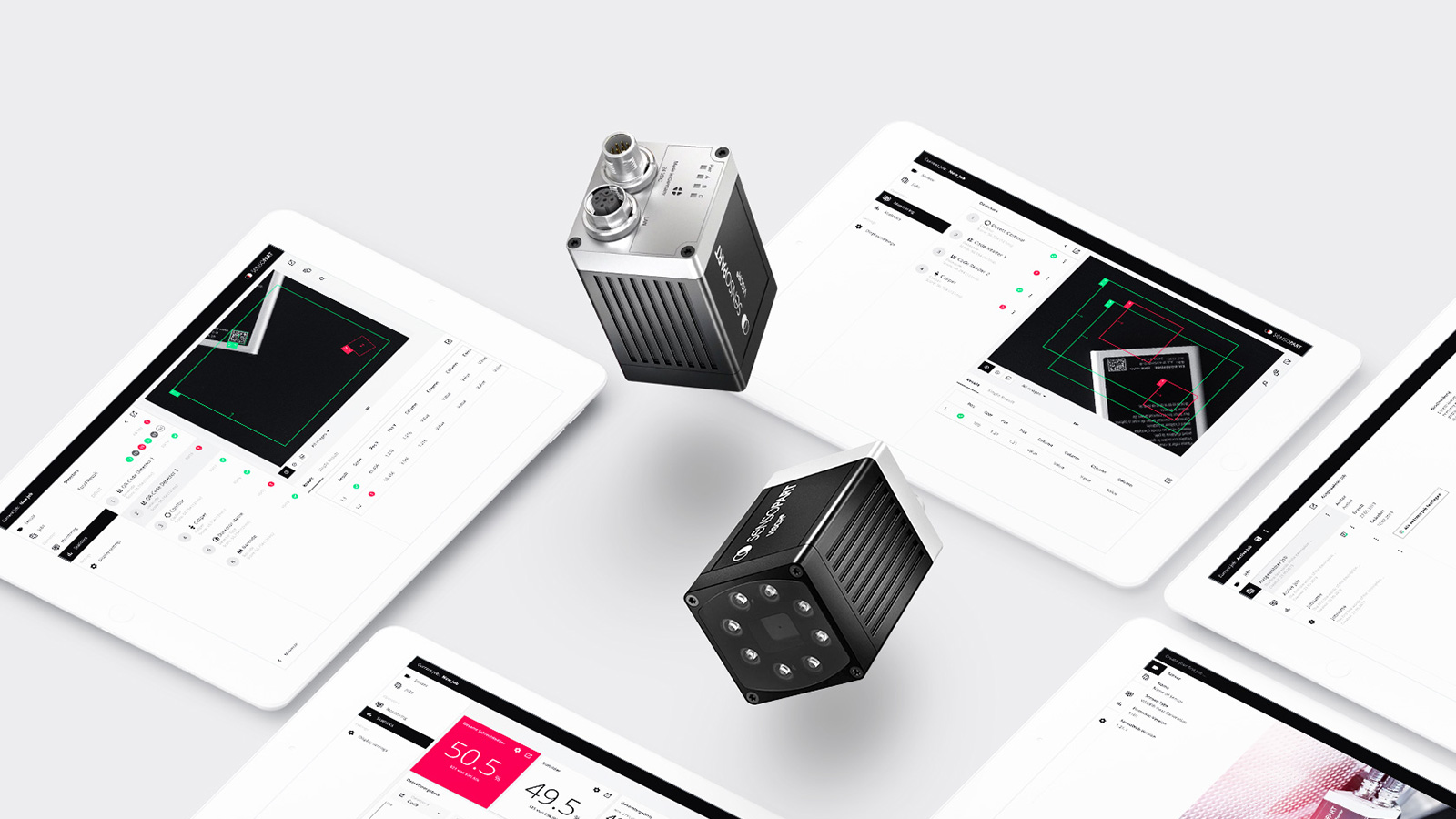
Our own talk “Proto-Types” very much tied into this and focused on the collaborative nature of Intuity’s design approach. Early stage prototyping and iterations play a major role in our field, for example as applied in our work for gigaset or moovel. But just as much as we think prototypes are necessary as a tool to develop common ground between stakeholders, we use it as a tool for inspiration and speculation. Because this is what designers constantly should think of: how to change the existing for the better, and how something MIGHT be in the future.
Many thanks to the Webfontday team, especially Boris and Oliver.
